Because you spent hours curating the perfect desk setup while your laptop wallpaper is still the factory default.
There’s a certain kind of creative woman who has that perfectly beautiful desk – carefully chosen stationery, a candle featuring her signature scent, plants growing in the light, all in a perfectly curated colour palette. Maybe you know her, maybe you’re following her on Instagram or Pinterest – or maybe you are her! Either way, her desk is perfect.
…Well, as long as you don’t look at her desktop.
Twenty-three tabs open on two different browsers. The screen covered in files named “untitled257947” and “finalfinalv3ACTUALLYfinal”. A notes app that looks like a dictionary exploded in it. A calendar that is technically functional, but deeply ugly. The default system wallpaper.
If this sounds familiar: hi, same. But it doesn’t have to stay that way, girl!
If you’re anything like me, your digital workspace is where you spend a significant portion of your waking life. It deserves the same care and attention you give your IRL space! The good news is that making your screen feel as intentional as your space is actually not that difficult once you know where to start.
Why your digital aesthetic actually matters
This is not solely a vanity project. There’s a real reason why a cluttered, visually chaotic digital environment makes it harder to focus and think clearly.
Your brain processes visual information constantly, even when you’re not consciously paying attention to it. A screen that’s overwhelming to look at creates low-level cognitive friction that adds up over the course of a day. It’s subtle, but it’s real. You’re spending mental energy processing visual noise instead of doing actual work.
On the flip side, a clean, visually cohesive digital workspace does the exact same thing a well organized physical desk does. It signals to your brain that this is a space for focus. It reduces friction. It makes sitting down to work feel less like wading through chaos and more like settling into something that’s actually yours.
And, honestly? It makes opening your laptop feel good! That matters more than people give it credit for. When your workspace is somewhere you want to be, showing up consistently gets so much easier.
Start with your wallpaper and colour palette
Your wallpaper is the foundation of your whole digital aesthetic, so it’s worth spending time on it rather than just using the first pretty picture you find.
Think about what you want your workspace to feel like. Calm and minimal? Warm and cozy? Artsy and colourful? There’s no wrong answer here, but being intentional about the feeling you’re going for will help you make choices that actually hold together visually rather than just looking nice individually.
For wallpapers, here’s some good places to look:
- Free stock image websites like Unsplash and Pexels have a huge range of high-quality photographs for you to download and use
- Pinterest is well-loved for a reason, it makes it easy to find images that match your aesthetic – but be sure to hunt down the original sources to find high-quality versions that will work as wallpapers
- Shops on Etsy and Gumroad sell digital wallpaper packs specifically designed for desktops, and a lot of them are absolutely gorgeous
- If you have a creative side, you could try make your own with Canva!
Once you have your wallpaper, notice the two or three dominant colours in it – use the Coolors palette maker if you want specific hex codes. These become the basis of your palette. If you can, carry these colours through the rest of your digital setup – your folder icons, your calendar colour coding, your Notion covers, your browser theme. Visual consistency across your whole workspace is what makes everything feel intentional, rather than just “I have a nice wallpaper”.
Less is more (when it comes to your desktop)
The desktop is where a lot of otherwise aesthetically-minded people just completely give up. Files get dropped there because it’s quick and easy, and before you know it, you can’t even see that beautiful wallpaper anymore!
The most satisfying digital desktops are almost empty. Not because they don’t have files – they do – but because those files live somewhere other than the desktop. A simple folder structure inside your documents is all you need. The desktop is for looking at, not for storing things.
If you use a Mac, the app Unsplash Wallpapers rotates your wallpaper automatically from a curated library which makes the whole desktop feel alive. On Windows, there’s a built-in spotlight feature which does something similar.
For your actual desktop icons, if you do keep a few things there, custom icon packs can make a surprising difference. A cohesive set of icons in your colour palette instead of the default app logos transforms the whole look. You can find icon packs on sites like Etsy, or even try make your own in Canva!
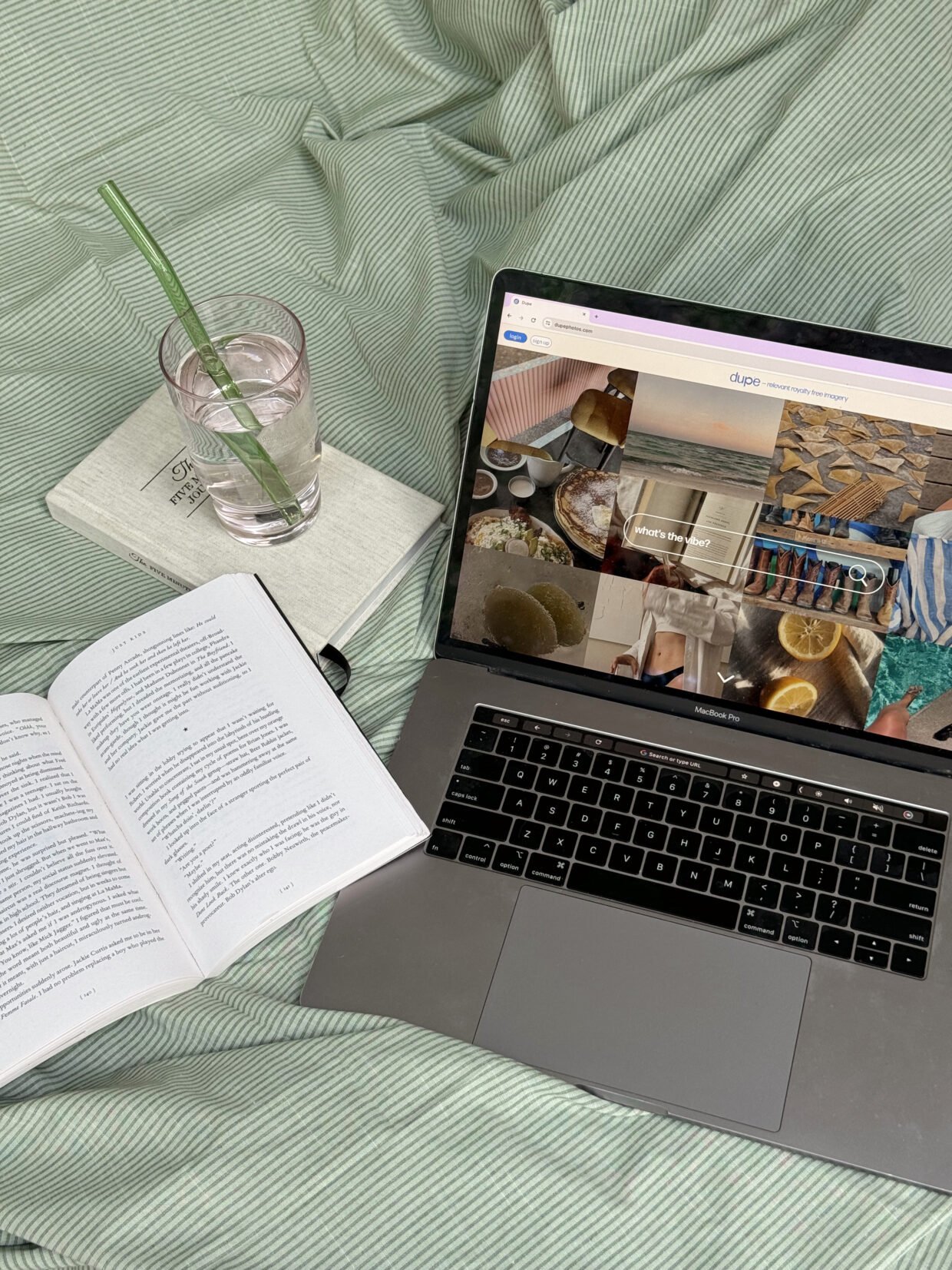
Your browser – AKA the space you probably spend the most time in
Your browser is worth investing in aesthetically because, honestly, you live there. A browser theme that matches your palette, a new tab page that feels intentional rather than just functional, and some folder organization in your bookmarks bar will do a lot of heavy lifting.
For Chrome, the built-in themes are limited but there are extensions that give you much more control. Momentum is a popular new tab replacement that gives you a photo, a daily focus intention, and a simple to-do list.
Bookmarks folders with clear names and a logical structure also contribute to the feeling of having a space that’s under control. Even if you barely ever look at your bookmarks, knowing they’re organized somehow makes the browser feel less chaotic.
Make your calendar actually nice to look at
If you use a digital calendar, you probably spend a fair amount of time looking at it – and most people’s calendars look like a bowl of smarties exploded because of all the randomly assigned colours that nobody bothers to change.
Take thirty minutes to go through your calendars properly. Assign colours that feel intentional and actually give off a vibe you like, maybe using that palette we established earlier. Giving each category of your life a distinct colour will help you read your week at a glance without overwhelm.
With Google Calendar, you can set custom colours outside of the preset ones by creating individual calendars for each category of your life. If you prefer Notion, there are also templates like our Heisei Retro Life Dashboard that have integrated calendar views!
Your notes app and writing spaces
This one varies hugely depending on what tools you use, but the principle is the same – a writing environment that feels calm and aesthetically pleasing is the one you’ll actually want to open and use.
If you write in Notion, you probably already know how extensive the visual customization options are. Cover images, icons, fonts – you can make a Notion workspace that looks genuinely beautiful (and believe me, I’d know!). There’s also a dark mode to ease eye strain through long writing sessions.
If you write in an app like Google Docs or Obsidian, most of them offer themes and customization options worth exploring. The right font and background colour for writing is a personal thing; some people write better in bright white minimal environments, while others need something moodier. Try a few things and notice what actually helps you focus.
Even your notes app is worth a look! If you use Apple Notes or Google Keep, you can do limited things, but choosing a consistent colour for your notes and keeping them organized goes a long way toward making the space feel less frantic.
The font situation
Fonts have a bigger impact on how a digital space feels than people realize. The system defaults are fine, but not always inspiring, and replacing them where you can with fonts that fit your aesthetic is one of those small changes that does a lot.
In Notion, you can choose between a few font options – mono, serif, or sans serif (I’m a serif girl, myself). There’s a bit more flexibility with Windows than on Mac for system fonts, from what I’ve heard. Check your system settings!
If you design anything, even just headers for your own documents or covers for your Notion pages, having one or two fonts you love and use on repeat can go a long way in making your workspace feel cohesive and yours. Google Fonts is free and has a ton of great options – then there’s always my favourite place, DaFont, for gorgeous (and mostly free to use!) fonts in a wide range of styles from classic serifs to bold and quirky displays.
Bringing it all together
The goal with a digital aesthetic isn’t perfection, it’s about creating an environment that feels like yours – calm, intentional, visually cohesive (if that’s your vibe) – so that the actual work you do there takes centre stage.
Start with just one thing. Change your wallpaper today. Spend twenty minutes organizing your desktop. Redo your calendar colours this weekend. You don’t have to overhaul everything at once! Small, consistent changes add up quickly, and at a certain point you’ll open your laptop and realise it actually feels like a space you want to spend time in.
Your physical desk got there one candle and one carefully chosen notebook at a time. Your digital workspace can too!
BTW, if Notion is part of your digital setup, our templates at the notique shop are designed to be both functional and beautiful – come take a look and see if anything feels like you. 🌸